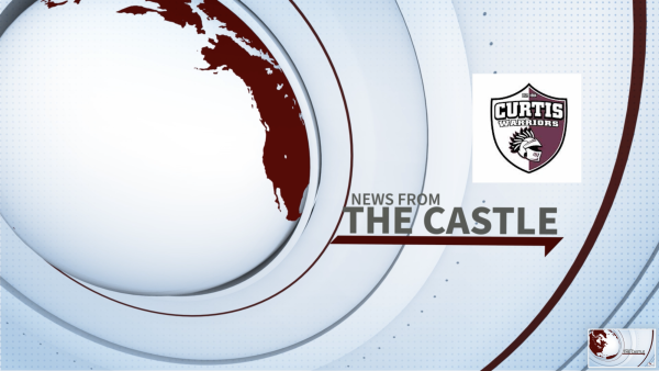
New school logo unveiled Curtis
The new official logo combines key elements from many Curtis traditions.
Shirts, hats, banners and letterheads are now emblazoned with either a shield, a helmet or both. The recent logo creation is the outcome to a problem that started in 1994 after the original Native American logo had to be removed. Once the Indian mascot was removed there was no continuity.
Before the new logo was created school apparel lacked unity. Each teams and clubs had different designs. The only characteristics they all shared were the Curtis colors and the Warrior name.
Now that there is one official logo with very specific guidelines on its use. Even the exact maroon color is listed. The company that helped guide the team in creating a logo, B1 Self Brand Empowerment, created a 12 page brand book dictating the proper way to use the logo.
Dr. Curtis decided that a unified logo would help promote an overall unified school. Over the course of four months a committee helped design the new logo. Along with Dr. Curtis, Joe Sicilian, Peter Gambardella, Pete Devlin, Travis Carter, Cadence Turner Jenn Korten and Eric Ritzer poured over ideas, argued over chin size, feather placement, even whether there should be a san serif or serif font. The committee represented over 150 years of Curtis experience and also included three alumni.
The goal of the committee was to preserve tradition, represent the school, and create a unique logo for Curtis. According to Ms. Turner, journalism teacher and newspaper and yearbook adviser, the logo helmet was chosen; not just as a warrior reference, but also as a nod to the Gothic nature of the building.
In this logo the nine feathers symbolize the nine houses at Curtis. The four air holes in the helmet represent the year 1904, the year Curtis was built. The shield was thought to be more academic and could be used with or without the helmet inside.
Most of the students have responded positively to the recent logo change. Luis Carazas, a sophomore, says, “It has a look of power. In a way, it shows protection and gives confidence.”
Mohamed Katherhassan, a sophomore, said “I like the logo because it resembles a shield that protects the castle.”